
In this article, we will delve into the history and characteristics of Bebas Neue font, its usage, and why it’s important for graphic designers and typography enthusiasts. We will also explore alternatives to Bebas Neue that can be used to achieve similar results.
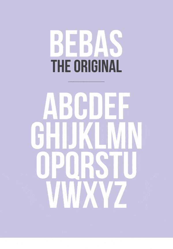
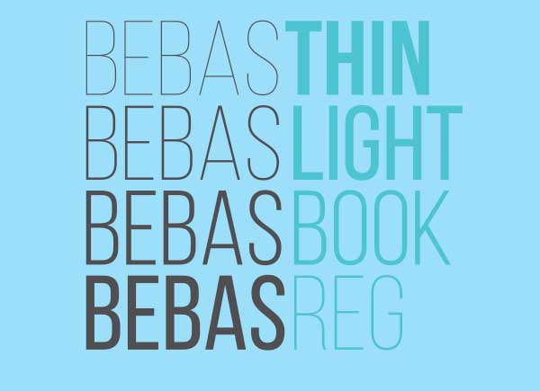
What is Bebas Neue Font? Bebas Neue font is a sans-serif typeface that was designed by Ryoichi Tsunekawa in 2010. It’s a reimagined version of the original Bebas font that was released in 2005. Bebas Neue has a clean, modern look that has made it a popular choice for a wide range of design projects.
Characteristics of Bebas Neue Font Bebas Neue font has some unique characteristics that set it apart from other sans-serif typefaces. It has a bold, strong, and condensed style that makes it ideal for headlines, banners, and logos. Its uppercase letters are simple and geometric, while the lowercase letters have a more traditional look with descenders and ascenders.
Usage of Bebas Neue Font Bebas Neue font has been used in various design projects, including print and digital media. It’s commonly used in logos, headlines, banners, and posters. Due to its bold and condensed style, it’s also used in packaging design and web design.
Why is Bebas Neue Font Important? Bebas Neue font has gained popularity among graphic designers and typography enthusiasts because of its bold and modern look. It’s a versatile font that can be used in various design projects, and it has become a staple in many designers’ toolkits.
Alternatives to Bebas Neue Font While Bebas Neue font is a popular choice for designers, there are many alternatives that can be used to achieve similar results. Some popular options include Avenir, Proxima Nova, and Gotham. These fonts have a similar style to Bebas Neue but offer unique characteristics that make them stand out.
