

Collegiate Font: A Complete Guide for Designers and Students
Are you a designer, student, or sports enthusiast looking for a font that conveys a sense of professionalism and athleticism? Look no further than collegiate font! This typeface is commonly associated with academic and sports settings and is perfect for creating logos, posters, and other designs that require a bold and dynamic look. In this article, we will provide a comprehensive guide to collegiate font, including its history, characteristics, and usage.
What is Collegiate Font?
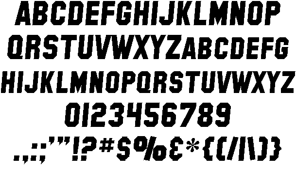
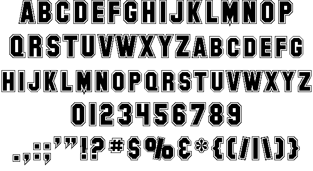
Collegiate font is a typeface that originated in the United States during the early 20th century. It was first used by universities and colleges to create sports team logos and posters. The font is characterized by its bold, blocky letters, which are reminiscent of the letters used on varsity jackets and other athletic apparel. Collegiate font is often associated with academic and sports settings and is commonly used to create logos, posters, and other designs that require a bold and dynamic look.
History of Collegiate Font
The origins of collegiate font can be traced back to the early 20th century when it was first used by universities and colleges to create sports team logos and posters. The font gained popularity in the 1920s and 1930s when American colleges and universities began using it extensively in their publications and marketing materials. Since then, collegiate font has become a staple of American design and is commonly associated with academic and sports settings.
Characteristics of Collegiate Font
Collegiate font is characterized by its bold, blocky letters, which are often outlined and filled with a second color. The font is usually in all caps and features large serifs that make it easy to read from a distance. The letters are typically wider than they are tall, which gives them a sense of stability and strength. Collegiate font is available in a range of styles and weights, including regular, bold, and condensed, making it a versatile typeface that can be used for a variety of purposes.
Usage of Collegiate Font
Collegiate font is commonly used in academic and sports settings, where it conveys a sense of professionalism, athleticism, and tradition. It is often used to create logos, posters, and other designs that require a bold and dynamic look. Collegiate font can also be used in other settings, such as advertising and branding, where it can help to create a strong visual identity. When using collegiate font, it’s important to keep in mind that it is a bold typeface and should be used sparingly.
Tips for Using Collegiate Font
Here are some tips for using collegiate font effectively:
- Pair it with a simple sans-serif font to create contrast and balance.
- Use it sparingly to avoid overwhelming your design.
- Experiment with different styles and weights to find the one that works best for your design.
- Combine it with images and graphics to create a dynamic and eye-catching design.
Examples of Collegiate Font
Here are some examples of collegiate font in action:
- The logo for the University of Michigan football team, which features bold, blocky letters in the school’s blue and yellow colors.
- The logo for the clothing brand Abercrombie & Fitch, which features a bold, all-caps version of the font.
- The poster for the 1977 movie “Slap Shot,” which features a bold, outlined version of the font.