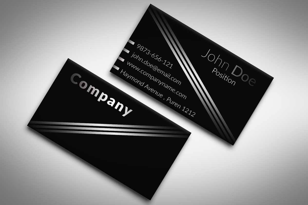
Business cards are crucial to creating an indelible first impression. The choice of font plays an important role in this, because it affects the aesthetics and readability of the postcard.
This article discusses the pros and cons of various fonts for business cards, as well as information that will help you make an informed decision.
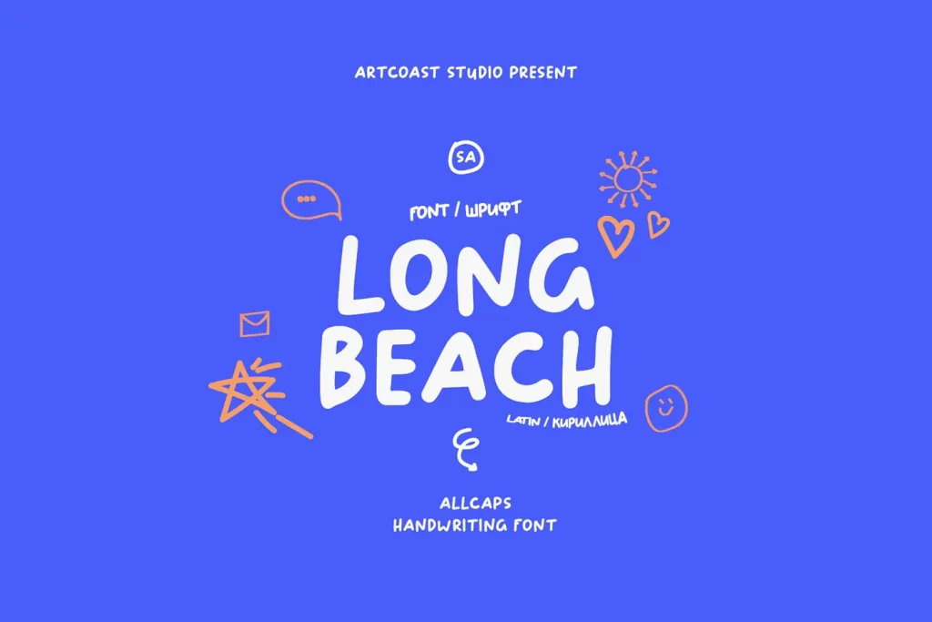
SA Long Beach Cyrillic Font
Advantages
- Unique and Eye-catching: Its handwritten style distinguishes it from more conventional fonts, enhancing memorability.
- Soft and Personal Aesthetic: Rounded and curved letters exude warmth and approachability, aiding in relationship building.
- Versatile: Suitable for various designs, from minimalist to creative.
Font Flaws
- Limited Readability: Handwritten style can be challenging to read, especially at small sizes.
- Not Universally Professional: May not fit all industries, particularly more conservative ones.
- Potential for Misinterpretation: Could be viewed as unprofessional or careless.
Usage Tips
- Employ larger sizes for readability.
- Use contrasting colors for text.
- Pair with simple designs.
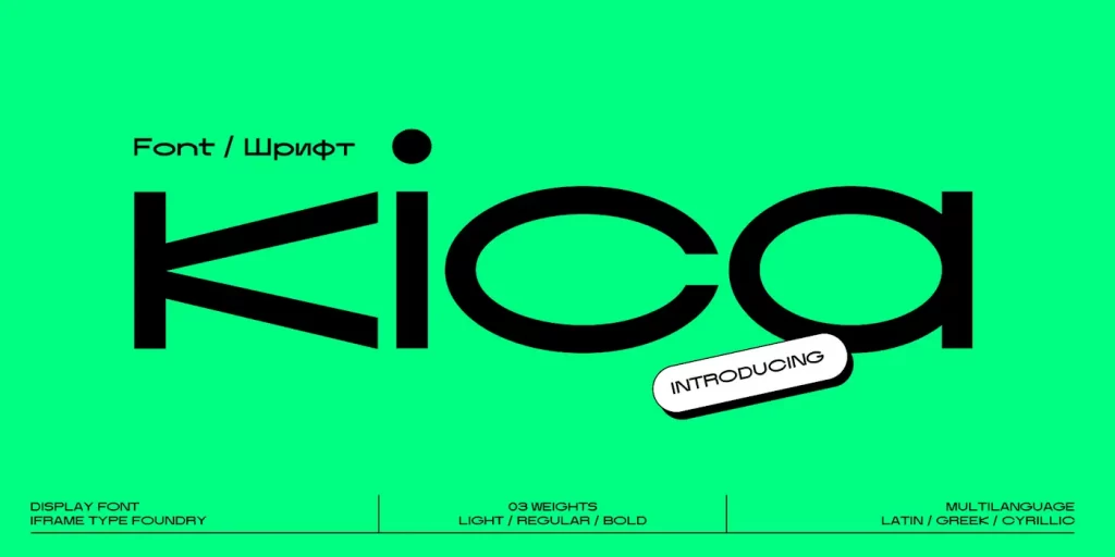
IF Kica Cyrillic Font
Advantages
- Stylized and Eye-catching: Distinctive letterforms grab attention.
- Modern and Elegant Aesthetic: Clean lines and minimalism convey sophistication.
- Clear Readability: Maintains legibility even in smaller sizes.
Font Flaws
- Limited Versatility: May not suit all industries or card designs.
- Potential for Misinterpretation: Could seem overly trendy or unprofessional.
- Not Ideal for Long Text: Bold, condensed nature limits text volume.
Usage Tips
- Use sparingly for impact.
- Pair with minimalist designs.
- Opt for larger sizes for readability.
Balpaq Cyrillic Font
Advantages
- Unique and Memorable: Bold lines and geometric shapes are eye-catching.
- Modern and Contemporary: Aligns with current design trends.
- Clear Readability: Remains legible at smaller sizes.
Font Flaws
- Limited Versatility: Strong personality might not fit all industries.
- Potential for Overwhelming Appearance: Excessive use can clutter the card.
- Not Ideal for Creative Businesses: May clash with artistic or emotional themes.
Usage Tips
- Use sparingly to avoid overwhelming.
- Complement with a clean layout.
- Utilize contrasting colors for text.
Brushboy Cyrillic Font
Advantages
- Unique Handcrafted Aesthetic: Simulated brushstrokes offer a warm, personal feel.
- Creative and Playful Vibe: Conveys approachability and creativity.
- Versatility: Fits various card designs.
Font Flaws
- Limited Readability: Handwritten style may be hard to read at small sizes.
- Not Suitable for All Industries: May not fit conservative fields.
- Potential for Misinterpretation: Could appear unprofessional.
Usage Tips
- Use in larger sizes for clarity.
- Employ contrasting text colors.
- Pair with simple designs.
Buduj Sans Cyrillic Font
Advantages
- Clean and Modern Aesthetic: Geometric shapes and crisp lines create a sophisticated look.
- Excellent Readability: Ideal for essential information.
- Versatile: Neutral style suits various businesses.
Font Flaws
- Lack of Distinction: May not stand out among other fonts.
- Potential for Overwhelming Appearance: Heavy use can clutter the design.
- Not Ideal for Creative Businesses: Might clash with artistic themes.
Usage Tips
- Use sparingly to maintain impact.
- Pair with minimalist layouts.
- Consider larger sizes for longer text.
In conclusion, it is worth noting that each font has unique advantages and disadvantages for business cards. The choice should correspond to the corporate identity of the company and the message that he intends to convey. Combining these fonts with the appropriate design elements can increase the overall effectiveness of a business card.


