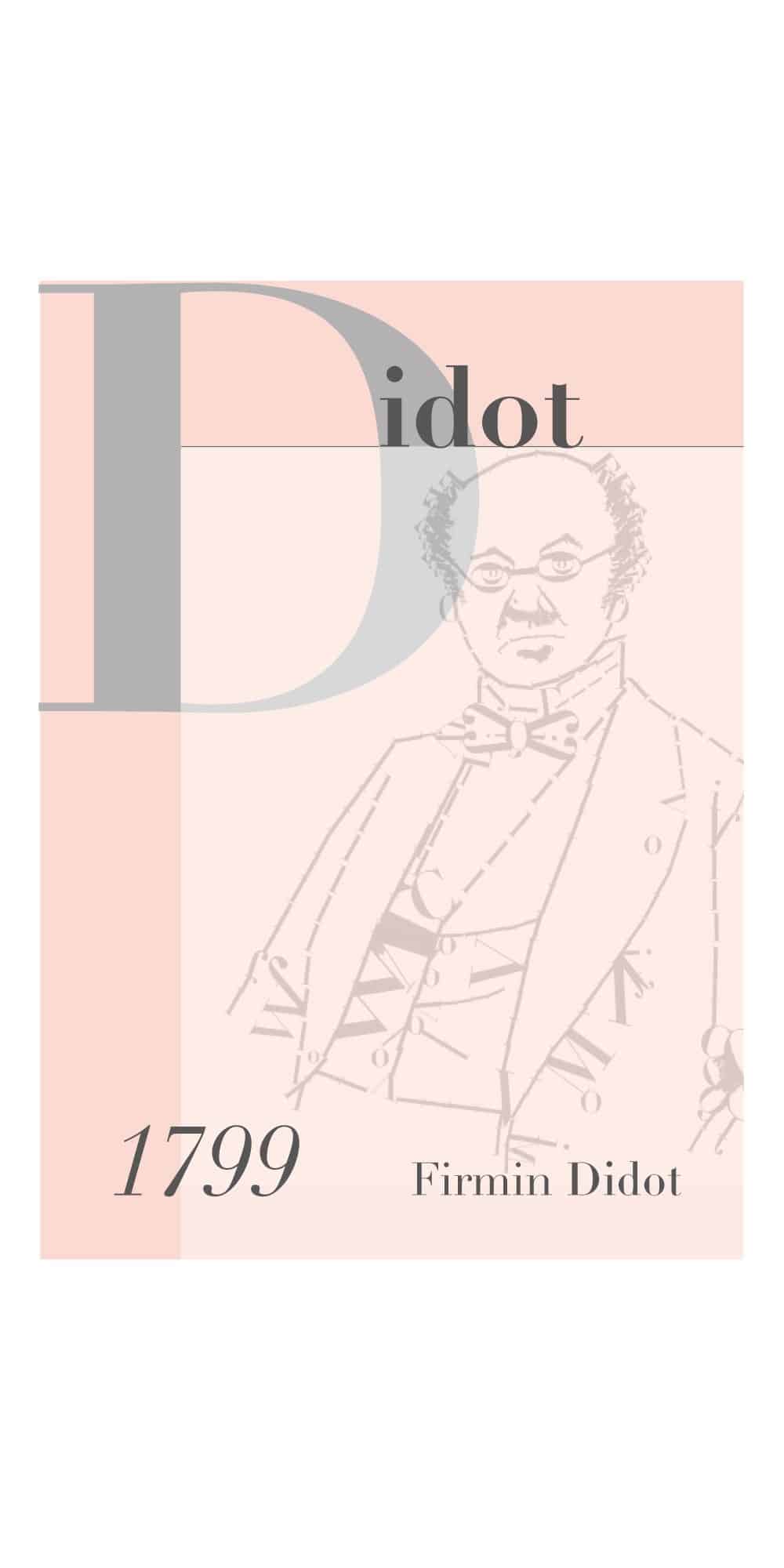
Didot 1799 Firmin Didot
Experience the elegance of the Didot 1799 Firmin Didot font, a timeless serif steeped in Parisian heritage and refined sophistication, perfect for high-end designs.
Available formats: OTF, TTF, WOFF
Discover Didot 1799 Firmin Didot
Elevate your design work with the timeless and classic Didot 1799 Firmin Didot font. Rooted in a rich history dating back to the dawn of modern typography, this font carries the innovation and elegance of 18th-century Paris, brought to life by the legendary Firmin Didot.
A Glimpse into History
Didot 1799 Firmin Didot stands as a hallmark of sophistication in the world of typography. Named after its creator, Firmin Didot, the font is a prime example of neoclassical type design that emerged during the late 1700s. It elevates the traditional serif structure with graceful, high-contrast strokes and thin, straight serifs, embodying a sense of prestige and authority.
Why Choose Didot 1799 Firmin Didot?
- Elegant Design: Perfect for luxury branding and editorial use, the Didot font exudes refined elegance.
- Historical Significance: A typeface with roots in the cultural and intellectual boom of Enlightenment-era France.
- Versatility: Suitable for a variety of high-end projects, from fashion magazines to upscale invitations.
Technical Details
When you download the Didot 1799 Firmin Didot font, you receive a collection of beautifully crafted types:
- Smooth, graceful lines for a classic aura.
- High contrast between thick and thin strokes, offering a distinct and clear reading experience.
- Optimal for projects that require a sophisticated touch.
Download and Start Creating
Ready to incorporate a piece of design history into your work? Click here to download Didot 1799 Firmin Didot and transform your creations into timeless masterpieces.
Tags: Serif, Classic
Unlock the potential to mesmerize your audience with elegance and historical allure. Experience Didot 1799 Firmin Didot today!