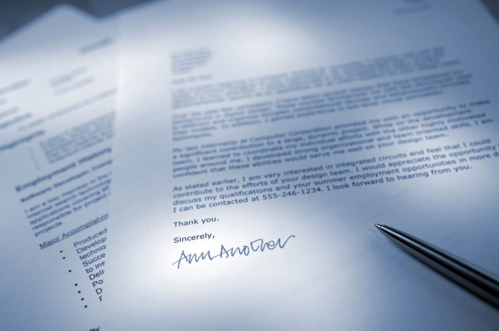
Font plays a huge role when creating a resume. The main task of the correctly selected font is to make the resume quickly viewed and easy to read.
Do not forget, it should take only 7 to 15 seconds for HR to view a resume, depending on the volume of text and the complexity of the vacancy.
If the font is too small or stylistically incorrect, recruiters will not be able to focus their eyes on the most important moments of career history.
On the other hand, the techniques of stretching the resume text into two pages or more will create a feeling of emptiness when a person has nothing to write and he is just trying to fill the space.
Basic rules when choosing a font for a resume
- The font should be simple. In a number of large companies and recruitment agencies, the first step of resume selection is entrusted to artificial intelligence in the form of a computer with a specially installed program. And only at the second stage a person is connected in the person of a recruiter or HR manager. That is why, first of all, the font should be easy to read by a computer program, that is, it should not contain “curlicues” or difficult-to-read strokes. This is important because if your resume does not pass the computer selection stage, neither the recruiter nor the employer will be able to see it.
- Headings should be headings. Do not write your first and last name at the beginning of the resume in too large font with a beautiful ornament in the style of capital letters of Russian folk tales. Such a design will not add attention to your resume, but such a maneuver can cause confusion. At the same time, no one forbids the use of interesting fonts and a larger font, but there should be a sense of proportion in everything.
- Be consistent. Once you’ve chosen the font style and letter size, don’t change them in every section of your resume. You should not abuse italics, enlarge letters, use caps lock, and also overly brightly color letters. Don’t make a rainbow out of a resume. After all, to highlight some important episode of career history, it is quite enough to use a bolder font.
A variety of fonts for resumes
There is no single font for all resume types. Depending on the type of profession, skill level and the nature of the vacancy, the appropriate font is selected.
Each font has its pros and cons, as well as certain rules of use. Among them there are the best and worst resume fonts, as well as the most versatile.
The classic font for resumes used to be Times New Roman, since all resumes were printed on a printer, and this font is the best for paper and reading in a text editor, such as Word.
Today, Calibri, Arial and Cambria are considered universal fonts for resumes. These fonts allow you to easily and quickly view your resume on the monitor screen, as well as clearly convey any career history, regardless of the complexity of terminology and the number of numbers.
However, for those who want to distinguish their resume from the mass of others, there are whole families of wonderful fonts that can give uniqueness and creativity to your career history.
Recommended fonts for resumes of different specialists
- Fonts for resumes of young applicants – Arial, Trebuchet MS.
- Fonts for creative resumes – Book Antiqua, Georgia.
- Fonts for business resumes – Lato, Helvetica.
- Font for resumes of engineers, doctors – Verdana.
- Font for lawyers’ resumes – Times New Roman, Didot.
- Font for IT resume – Helvetica, Book Antiqua (web designers)
- Font for academic resume (scientists) – Arial Narrow.
- The font for executive resumes is Garamond.
The choice of font for the resume should correspond to the industry, job role and culture of the company you want to get a job in.
While unique fonts can make a bold statement, the key to creating a positive impression is readability and professionalism. Combining personality with relevance ensures that your qualifications will remain the focus of your application.

