Angry
Showcase your designs with a bold, fierce, and dynamic vibe using the "Angry" font.
Available formats: OTF, TTF, WOFF
Evoke Strong Impressions with the “Angry” Font
Welcome to the daring era of design where bold, fierce, and dynamic rules. This calls for a potent digital brush that can portray powerful feelings and concepts. Say hello to “Angry”, a font dedicated to those not afraid to make strong statements.
Why Choose “Angry”?
The “Angry” font is much more than a collection of characters; it’s a design statement that screams originality and zestful extravagance.
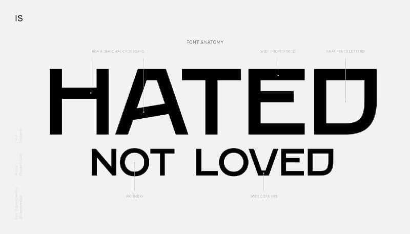
- Bold and Fierce: The thick strokes and pointed edges will make your text stand out, highlighting the fierce undertones of your content.
- Versatility: Despite its name, the “Angry” font is highly versatile and can be used for a multitude of purposes from poster design, logo creation, to social media graphics, and more.
- Unique Character: The “Angry” font stands out with its character, adding a unique aura to your design.
Make Bold Statements with “Angry”
As a creative designer, using the “Angry” font lends a strong visual impact to your work. It’s the perfect canvas to showcase your talent and imagination. Leverage its edgy details and bold letterforms to develop designs that are hard to forget and easy to admire. For impactful designs, vibrant color schemes combine perfectly with the “Angry” font to leave an indelible impression.
In conclusion, the “Angry” font is for those daring to be different, those not afraid to stir strong reactions, and those wishing to stand out from the crowd. Its versatility and originality make it a tool of real power in your design toolkit. So, are you ready to get creative and transform your designs with the “Angry” font?
Click on this link and download the “Angry” font now and revolutionize your design game.
Make your designs shout. Make them bold. Make them unique. Show the world your creative prowess with the “Angry” font.