Why Merriweather?
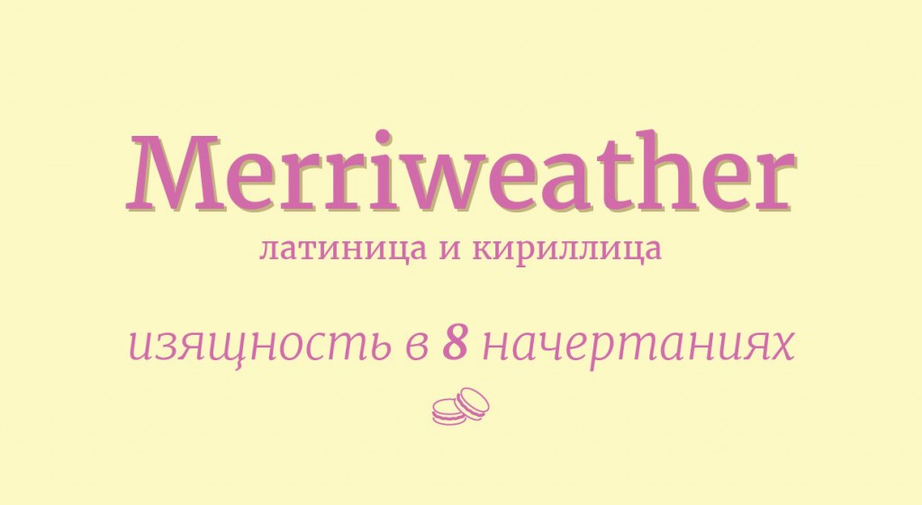
Merriweather is a versatile font that works well in a wide range of applications. It was designed by Eben Sorkin and has been a favorite among designers and typographers since its release in 2011. Here’s why we think it’s a great choice:
- High readability
Merriweather was designed with high readability in mind. It has a large x-height, which makes it easy to read even at smaller sizes. The spacing between letters and lines is also optimized for legibility, making it an ideal font for long-form content like blog posts and articles.
- Classic and timeless design
Merriweather has a classic and timeless design that works well in both print and digital media. It has a unique personality that sets it apart from other serif fonts, making it a great choice for brands that want to stand out from the crowd.
- Google Font availability
Merriweather is available as a free Google Font, making it easy to use in any web project. It’s also available for download on various font websites, making it easy to use in print projects as well.
Using Merriweather in your design projects
Here are some tips for using Merriweather in your design projects:
- Pair it with a sans-serif font
Merriweather works well when paired with a sans-serif font like Open Sans or Lato. This combination creates a nice contrast and makes the text easier to read.
- Use it for body text
Merriweather is an excellent choice for body text in blog posts and articles. Its high readability and classic design make it a perfect fit for long-form content.
- Experiment with different weights
Merriweather comes in multiple weights, from light to bold. Experimenting with different weights can help you create visual hierarchy and make important text stand out.
Conclusion
In summary, Merriweather is a versatile and classic font that is perfect for a wide range of design projects. Its high readability, classic design, and availability as a Google Font make it a top pick for designers and typographers alike. Try it out in your next design project and see for yourself why it’s our top pick.
