San Francisco Font
Sailors

Astrolight Signature

Mostra Nuova
Halja
Thunderstorm
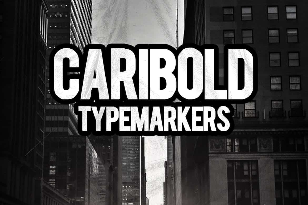
Caribold
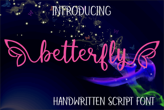
Betterfly
Rafaella
Best Free Fonts for Download: A Comprehensive Guide
Welcome to AllBestFonts, your ultimate destination for discovering and downloading high-quality typefaces. Our carefully curated collection features a diverse range of fonts, from elegant serifs to modern sans-serifs, expressive display fonts to practical monospace options.
Each font in our collection has been selected for its exceptional design quality, versatility, and practical applications in both digital and print projects. Whether you're a graphic designer, web developer, or creative professional, you'll find the perfect typeface for your next project.
Browse through our categories, use the search function to find specific styles, or explore our latest additions. All fonts are free to download and include proper licensing information for both personal and commercial use.