
ordeal eroded
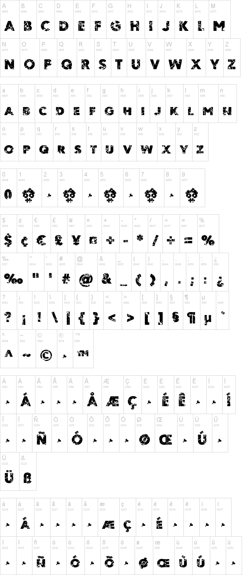
ORDEAL Eroded Font combines a unique grunge look with modern design, available in OTF, TTF, and WOFF formats, perfect for bold projects.
Unleash Your Creativity with ORDEAL Eroded Font
ORDEAL Eroded Font, created by Alex Smith in 2022, embodies a raw, eroded aesthetic that gives a contemporary twist to classical typography. This font is ideal for graphic designers looking to make a strong statement in projects such as posters, album covers, branding, and digital art that require an edge. Its textured appearance sets it apart, making it perfect for designs that strive for impact and originality.
Key Features and Formats of ORDEAL Eroded Font
The ORDEAL Eroded Font is available in various formats including OTF, TTF, and WOFF, ensuring seamless integration across multiple platforms and design software like Adobe Illustrator, Photoshop, and various web applications. Its unique eroded style allows designers to add a layer of depth and character to their projects, making it a versatile tool for both print and online media.
The Inspiration Behind ORDEAL Eroded Font
Inspired by the raw elements of urban landscapes, ORDEAL Eroded Font reflects a narrative of decay and rebirth, symbolizing resilience in design. Alex Smith’s vision was to capture the essence of gritty environments while retaining legibility, making it suitable for both headlines and body text. This font is not just a typeface; it’s an invitation to express individuality and creativity.
Ideal Applications for ORDEAL Eroded Font
ORDEAL Eroded Font excels in projects that benefit from a distinctive and artistic flair, such as music album covers, graffiti-inspired art, and promotional materials. Its strong character makes it perfect for headline text that needs to stand out without compromising readability. Use it in conjunction with other more subtle fonts to create a compelling visual hierarchy.