
Discover Beautiful Fonts
Explore our curated collection of high-quality fonts perfect for your creative projects
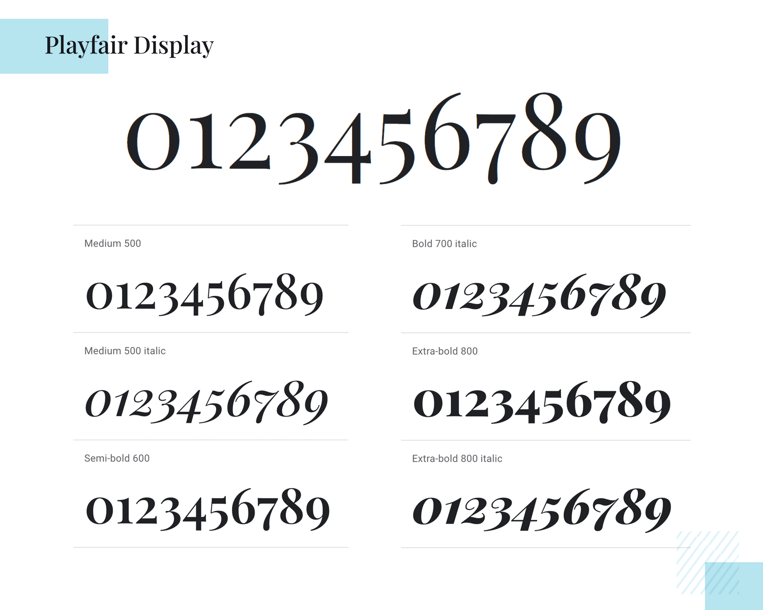
Latest Fonts
Discover our newest additions to the collection
23xx
Experience the innovative 23XX Font in TTF, OTF, and WOFF formats. Ideal for creative projects, branding, and modern web design.
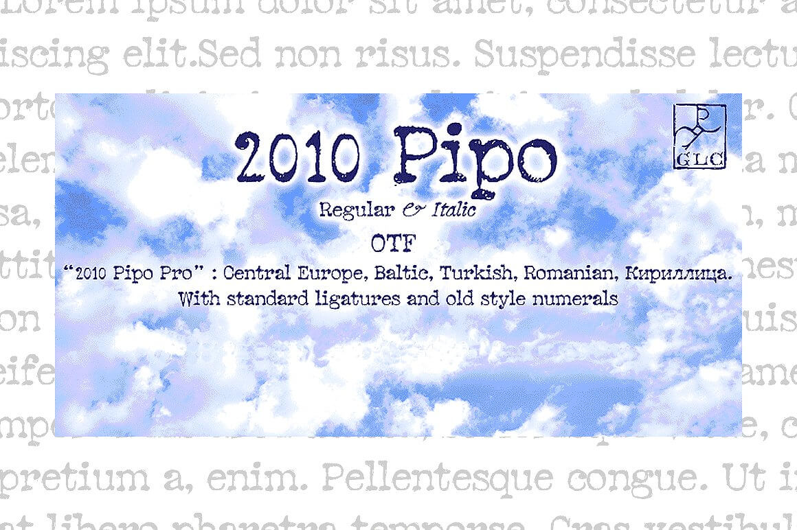
2010 pipo pro set otf
Pipo Pro Set OTF is a versatile font available in OTF format. Ideal for branding, digital content, and print projects. Perfect for creative design.
2peas hearts delight
2Peas Hearts Delight is an enchanting font available in OTF and TTF formats. Ideal for romantic designs, invitations, and themed projects.
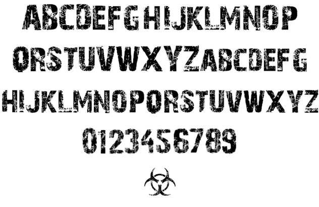
28 days later
28 Days Later Font is a unique grunge typeface available in OTF, TTF, and WOFF formats, perfect for horror themes, posters, and graphics.
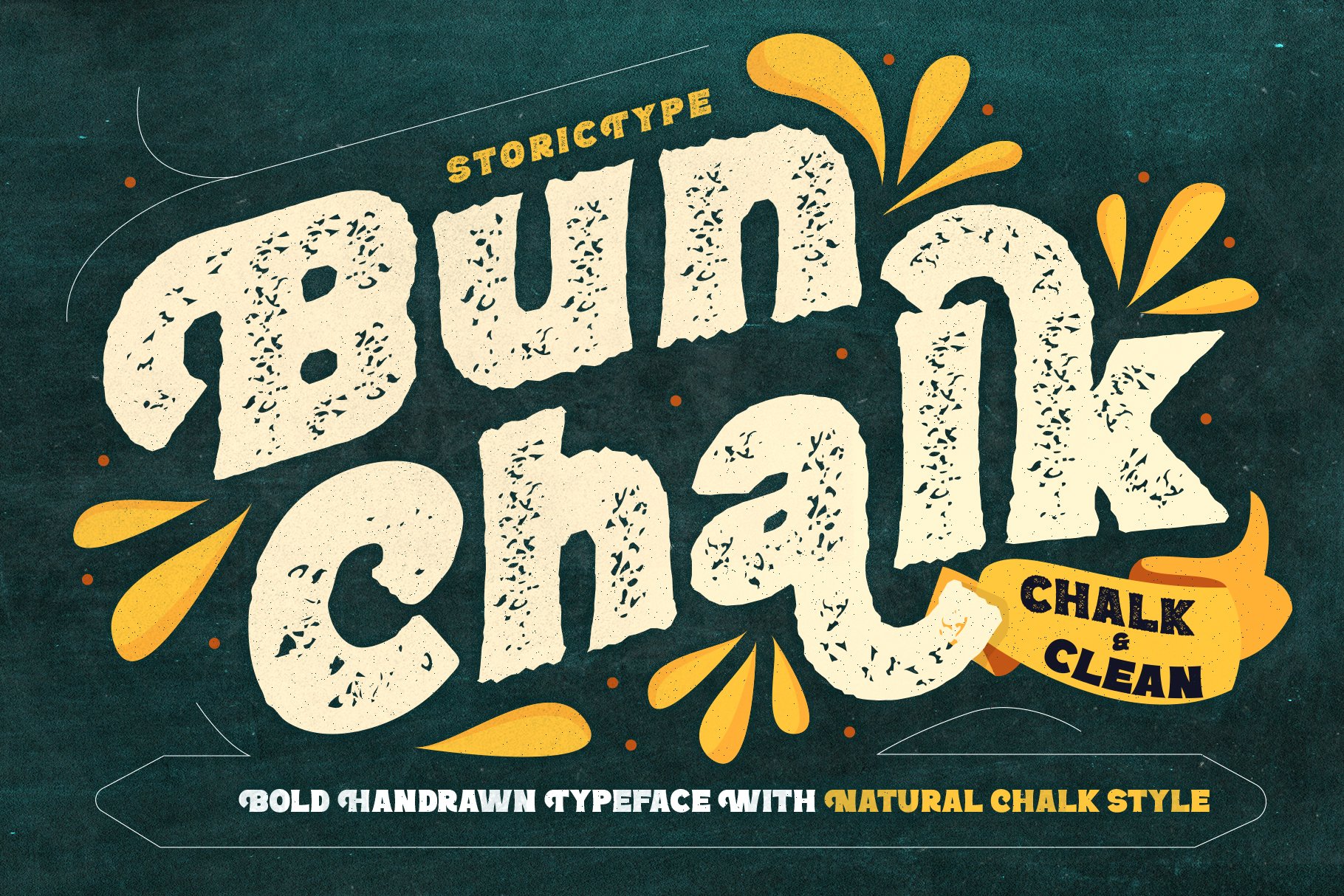
40 off vanderchalk typeface
40 OFF Vanderchalk Typeface offers a unique display style in OTF, TTF, and WOFF formats. Great for posters, branding, and modern design projects.
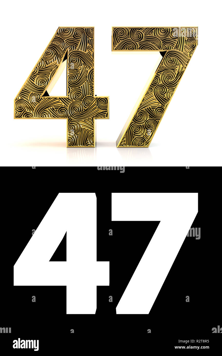
47
47 Font available in TTF, OTF, and WOFF formats. Ideal for modern design projects, branding, and digital applications.
13now font
13now Font offers a bold, modern design in TTF and OTF formats. Ideal for branding, websites, and dynamic graphic projects.
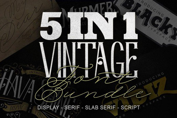
5 in 1 vintage bundle
Download the 5 in 1 Vintage Bundle in TTF and OTF formats. Perfect for retro designs, logos, and artistic projects that demand a vintage flair.