Family – Sans Serif
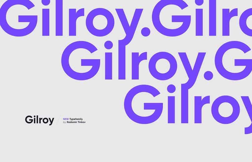
Gilroy is a modern sans serif with a geometric touch. A younger brother of the original Qanelas font family. It comes in 20 weights, 10 uprights and its matching italics. Created by Radomir Tinkov in 2016. Based in Sofia, Bulgaria, Radomir Tinkov began his career as a graphic and web designer. “Typography is an essential part of almost every aspect of life and design in particular,” he said, “so it got me curious and little by little I started to create fonts on the side”. Radomir officially created his foundry in 2009. Since then, this one man show has released a library boasting a wide range of styles including everything from best selling Qanelas, a modern sans serif with a geometric touch, to Maya Script, a playful script face. As for his creative Gilroy, this font designed with powerful opentype features in mind. Each weight includes extended language support (+ Cyrillic), fractions, tabular figures, arrows, ligatures and more. Perfectly suited for graphic design and any display use. It could easily work for web, signage, corporate as well as for editorial design.
Typography plays a crucial role in creating an aesthetically pleasing and effective design. Selecting the right font family for your project is essential, and the Gilroy font family is one that should not be overlooked. In this article, we will delve into why Gilroy is a must-have for your typography collection.
Gilroy Font Family Overview Gilroy is a modern sans-serif font family designed by Radomir Tinkov. It is known for its clean and geometric design that gives it a sleek and professional look. Gilroy is versatile and can be used for a variety of projects, from branding to web design.
What Makes Gilroy Stand Out One of the main features that sets Gilroy apart from other font families is its wide range of weights and styles. Gilroy has 20 weights, from Thin to Black, and each weight has its italic version, giving you even more options to choose from. This versatility allows designers to use Gilroy in a variety of contexts and projects.
Another feature that makes Gilroy unique is its excellent legibility. The font’s design is clean and straightforward, making it easy to read even at small sizes. This feature makes it an excellent choice for use in body text, as well as for headlines and titles.
Gilroy’s Applications Gilroy is suitable for a wide range of applications, from print to digital media. It is an excellent choice for branding, as it can be used to create a sleek and modern look. Gilroy is also a great font for web design, as its clean and simple design ensures legibility on all screen sizes.
Additionally, Gilroy is a great font for use in editorial design. Its legibility makes it ideal for use in body text, while its range of weights and styles allows for variation in headlines and titles. Gilroy’s versatility makes it a go-to font for many designers and is an essential part of any typography collection.
Conclusion Gilroy is a versatile and modern sans-serif font family that is a must-have for any designer’s typography collection. Its range of weights and styles, along with its excellent legibility, make it suitable for a wide range of applications, from branding to editorial design. If you are looking for a font that is clean, professional, and versatile, Gilroy is the right choice for you.

