How to Use Cookie Font in Your Designs
When it comes to graphic design, font selection plays a vital role in the overall aesthetic of your project. One of the most popular fonts for creating a warm and friendly atmosphere is the cookie font. It’s perfect for designs that require a playful touch or need to evoke a sense of nostalgia. However, using a cookie font in your designs can be a tricky business, as it’s easy to overdo it and end up with a tacky or cluttered result. In this article, we’ll discuss how to use cookie font in your designs effectively and tastefully.
What is a Cookie Font?
A cookie font is a type of script font that mimics the look of hand-drawn letters, as if they were written using a pastry bag. It’s called a cookie font because it resembles the icing on a freshly baked cookie. The font is typically cursive, with exaggerated loops and curves, and it has a playful, whimsical vibe. There are many variations of cookie fonts, ranging from more elegant and refined styles to more rustic and homespun ones.
When to Use a Cookie Font
Cookie fonts work best in designs that require a playful or whimsical touch. They’re ideal for creating a warm and inviting atmosphere, such as in a bakery or a candy shop. They’re also great for designs that target children or evoke a sense of nostalgia, such as in a vintage-style poster or a retro-style logo. However, cookie fonts may not be suitable for all designs, as they can be difficult to read in small sizes or in large blocks of text. They’re best used in headlines, logos, or short pieces of text that need to grab attention.
How to Choose a Cookie Font
When choosing a cookie font, it’s important to consider the context of your design and the message you want to convey. There are many different styles of cookie fonts, from elegant and refined to playful and quirky. Here are some tips to help you choose the right cookie font for your design:
Consider the Mood and Tone of Your Design
The mood and tone of your design should dictate the style of cookie font you choose. If you’re going for a more sophisticated look, a more elegant cookie font with clean lines and fewer flourishes may be more appropriate. If you want a more playful or whimsical look, a more exaggerated and playful font with lots of loops and curves may be better suited.
Consider the Legibility of the Font
While cookie fonts are meant to be playful and whimsical, they should still be readable. Some cookie fonts can be difficult to read in smaller sizes or in large blocks of text. Make sure the font you choose is legible and easy to read, even at smaller sizes.
Consider the Context of Your Design
The context of your design should also play a role in the font you choose. For example, if you’re designing a logo for a bakery, a more rustic and homespun cookie font may be more appropriate than a more refined and elegant one.
How to Use a Cookie Font in Your Designs
Once you’ve chosen the right cookie font for your design, it’s important to use it effectively and tastefully. Here are some tips to help you use a cookie font in your designs:
Use the Font Sparingly
One of the most important rules of using a cookie font is to use it sparingly. Cookie fonts can quickly become overwhelming and tacky if overused. Use the font for headlines or other pieces of text that need to grab attention, but avoid using it for large blocks of text or body copy.
Pair the Font with a Complementary Typeface
To balance the playfulness of a cookie font, it’s often a good idea to pair it with a more straightforward and legible type face. This will help create contrast and make the text easier to read. Sans-serif or serif fonts work well as complementary typefaces for cookie fonts.
Experiment with Color and Texture
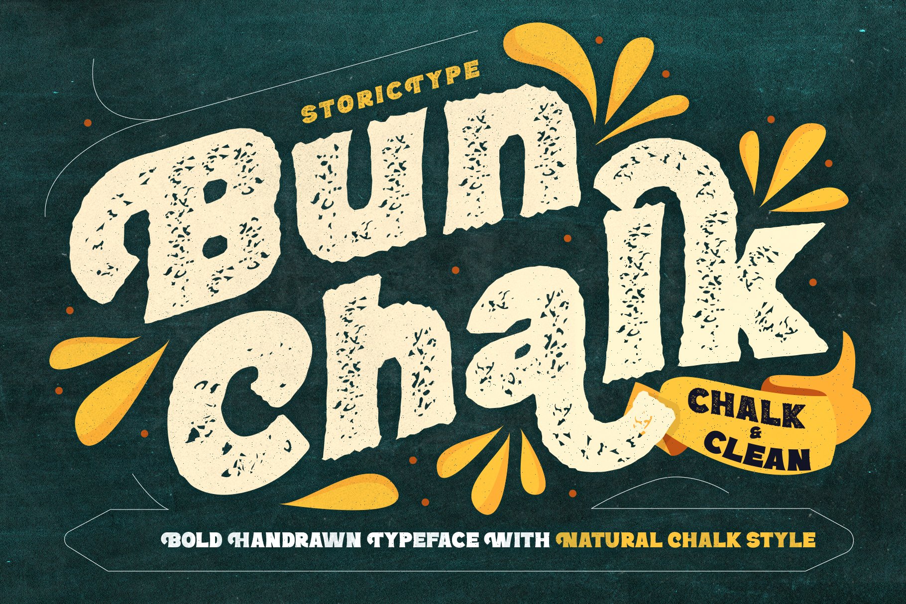
Another way to use cookie fonts effectively is to experiment with color and texture. Using a textured or patterned background can help enhance the playful and whimsical vibe of the font. Similarly, using contrasting colors for the font and the background can make the text pop and draw attention.
Use the Font in a Creative Way
Finally, don’t be afraid to use the cookie font in a creative way. Experiment with different layouts, shapes, and sizes to create a unique and eye-catching design. For example, you could use the font to create a custom illustration or graphic, or use it to create a unique and playful logo.
Conclusion
Using a cookie font in your designs can be a fun and creative way to add a playful and whimsical touch to your project. However, it’s important to use the font effectively and tastefully to avoid creating a cluttered or tacky design. By following these tips and guidelines, you can use a cookie font to enhance the mood and tone of your design and create a unique and eye-catching result.
FAQs
- Can I use a cookie font for body text?
It’s generally not recommended to use a cookie font for body text, as it can be difficult to read. Cookie fonts are best used for headlines or other pieces of text that need to grab attention.
- Are cookie fonts suitable for all types of designs?
No, cookie fonts may not be suitable for all types of designs. They work best in designs that require a playful or whimsical touch, such as in a bakery or candy shop.
- Can I use a cookie font for a logo?
Yes, a cookie font can be a great choice for a logo, especially if you’re designing for a bakery or other food-related business.
- Are there different styles of cookie fonts?
Yes, there are many different styles of cookie fonts, ranging from elegant and refined to rustic and homespun.
- How do I choose the right cookie font for my design?
When choosing a cookie font, it’s important to consider the mood and tone of your design, the legibility of the font, and the context of your design. Experimenting with different options can also help you find the right fit for your project.