Font is one of the main parts of the logo, which should not be neglected.
The correct font can emphasize the strengths of your logo (and your brand), while inappropriate and incorrectly chosen font can cause unpleasant associations and distrust of customers.
We decided to introduce you in this article to some types of fonts as well as font selection of features for the logo.
Several basic types of fonts is to provide:
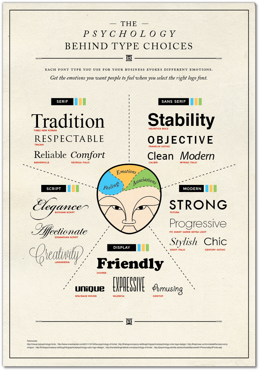
Group Fonts Serif – serif fonts are perpendicular to the bar at the end of each line; transmit the tradition, respect, reliability, comfort; are classic fonts (fonts examples: Times New Roman, Trajan, Baskerville, Georgia Italic);
Fonts Sans serif – sans serif font looks more modern; transmit desire, originality, neatness (font examples: Helvetica Bold, Franklin Gothic, Calibri, Myriad Italic);
Script – handwritten font – letters look as if pen written; convey elegance, creativity, tenderness (font examples: Bickham Script, Edwardian Script, Lavanderia);
Modern – a new style roman font; transmits determination, progressiveness, elegance, style (font examples: Futura, ITC Avant Carde Extra Light);
Display – stressful original fonts used in logos not often. These fonts help express amusing, unique, friendliness (the font examples: Cooper, Spaceage Round, Valencia, Giddyup);

Tips on how to choose the font for the logo:
1. Keep it simple.
Logo with a simple script is easier and more convenient to print on different media. Therefore, please note that you may need to increase or decrease it. Make sure that the font in the logo looks good, both on the business card and on a large poster, as a pen, and on promotional items.
2. Check the fonts used your competitors.
It is not necessary for them to copy, but rather to analyze and determine that they are done correctly or incorrectly. Thus, to learn from them the right example.
3. Set the mood with the help of text, taking into account the spirit of your business.
Font makes your logo recognizable and memorable. You must clearly identify which font to best fit your business. It can be serious, even, orderly or playful, casual, fun transmission. It can also carry a novelty or transmit the spirit of tradition and conservatism.
Different areas of business are different values. Accordingly, the fonts will be different. Serious law firm will not choose the same font for the logo as a bridal salon. Consider what product or service you offer customers. Define your target audience, and what features of your business, you want to emphasize.
4. It is not necessary to combine a large number of fonts in the logo.
The best option is to choose a one or two fonts. Using a large number of fonts may look ugly and cause distrust among customers.
Please note that the branded companies often use only one font in the logo. At the same time, many small companies in the logo use the one font, and slogan – the other one.
5. Do not try to buy the trendy fonts.
Trend fonts out of fashion very fast. Today, one font is a trend, and tomorrow – no longer exists.
So if you focus on the prosperity of your business more than one year, you should not chase fashion trends, and be focused on the aims and image of your business and choose their corresponding font.
